Page 30 of 162
Posted: Sun Jun 01, 2008 10:55 pm
by futures_untold
I think you need to make clearer reference to big fat speakers... Apart from that, looking good!

Posted: Sun Jun 01, 2008 11:50 pm
by djelements
Awesome.
Posted: Mon Jun 02, 2008 7:58 am
by pscal
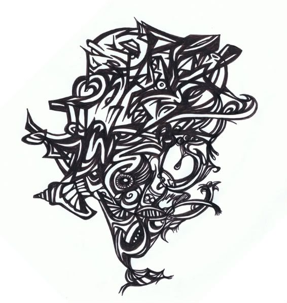
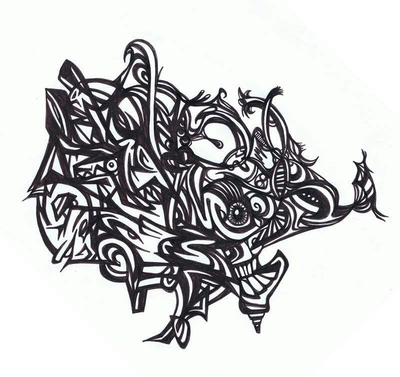
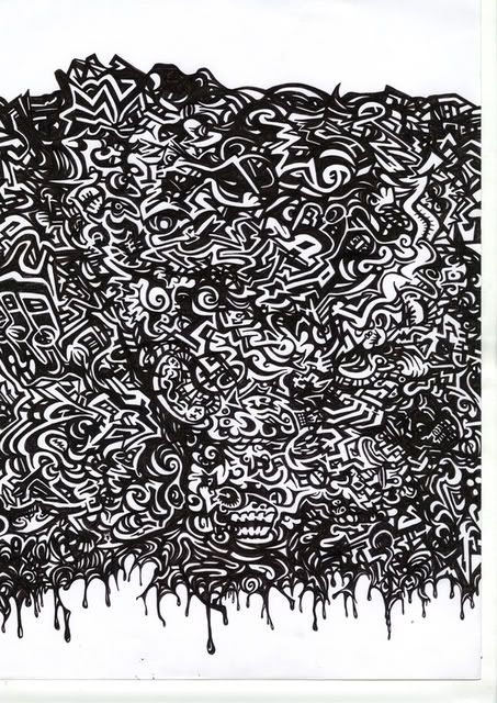
made another one!
these are still just try-outs though!

Posted: Mon Jun 02, 2008 12:53 pm
by gwa
take the full stops out of the type, and pick a more modern / vectory text other than the basic arial buznuzzzzz.
edit.
other than that its really nice
Posted: Mon Jun 02, 2008 4:13 pm
by pscal
its not arial... I hate arial!

its century gothic, my favorite typeface!

but I'll look into it!
Posted: Mon Jun 02, 2008 4:40 pm
by theevilgirl
pscal wrote:made another one!
these are still just try-outs though!
I like your style...i LOVE illustrator....
but....
it looks like a vagina...
Posted: Mon Jun 02, 2008 4:41 pm
by Jak The lad
TheEvilGirl wrote:pscal wrote:made another one!
these are still just try-outs though!
I like your style...i LOVE illustrator....
but....
it looks like a vagina...
lol, thats what I thought.
Or its the dubstep squid from the 'night' video.
Posted: Mon Jun 02, 2008 5:50 pm
by pscal
hahaha, a vagina? omgwtfbbq!
wich part? cause I dont really see it... maybe you're used to different ones then I am!
haha
but like I said, its just a try-out
nowhere near the final result me thinks
Posted: Mon Jun 02, 2008 5:52 pm
by Jak The lad
the tentacles look like lady legs and the droppy bit looks like an old ladies flange.
Posted: Mon Jun 02, 2008 5:52 pm
by theevilgirl
look at it!!
her legs are spread eagle and her cooch is right in the middle
or even the bright pink area looks like the actual vagina (like...inside)
and then the hole under it...
whats on your mind when ur making art hmmmm
Posted: Tue Jun 03, 2008 12:56 am
by tempest
hahahaha, personally I like the dubstep flange
Posted: Tue Jun 03, 2008 7:00 am
by gmk

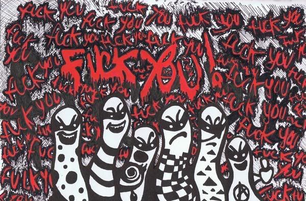
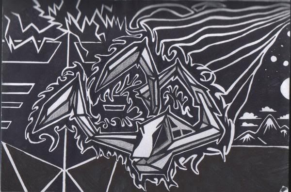
poster illustration i did for a local crew's 1'st year anniversary bash
Posted: Tue Jun 03, 2008 7:37 am
by Jak The lad
gmk wrote:
poster illustration i did for a local crew's 1'st year anniversary bash
wow, overly BIG!
Posted: Tue Jun 03, 2008 10:03 am
by horse
JTL wrote:gmk wrote:
poster illustration i did for a local crew's 1'st year anniversary bash
wow, overly BIG!
x 100
loving that!!
anyone on deviant art?
add me
here
Posted: Thu Jun 05, 2008 10:47 pm
by deadlycrusher
dTruk wrote: nice pieces aswell deadlycrusher. keep spreading the truth - on a side note, i think i still have a few of your tunes on here and my mp3 player. from versionist 1 or 2 years back i think.
cheers. my tunes were terrible back then but are slowly getting better, just posted a new one tonight on here in the dubs section - will be interested to see what you to think.
nice pics mate
Posted: Fri Jun 06, 2008 6:03 am
by futures_untold
Posted: Sat Jun 07, 2008 9:18 am
by d-T-r
Posted: Sat Jun 07, 2008 11:59 am
by psyolopher
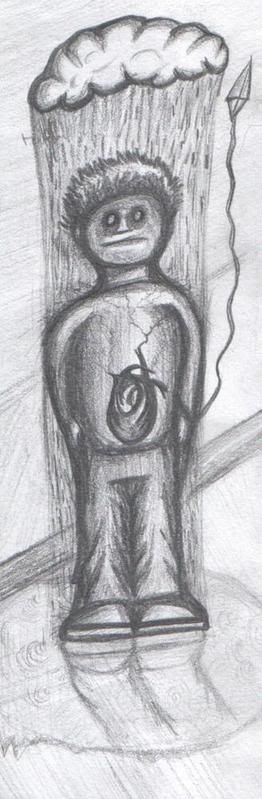
Actually, i have an idea for a logo...
But to noob at photoshop!
my logo was an eye, with an mushroom on it(dont question it)
You know any tutorials i can make it a worthy graphic?
Posted: Sat Jun 07, 2008 12:07 pm
by Jak The lad
gmk wrote:
poster illustration i did for a local crew's 1'st year anniversary bash
Also, if you can do a design like this and put it on a t-shirt, pm me
i'll buy one. Or even if you can justs end me a high res design like this for a tee
Posted: Mon Jun 09, 2008 6:21 pm
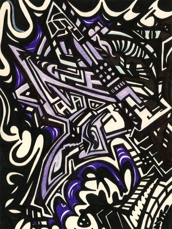
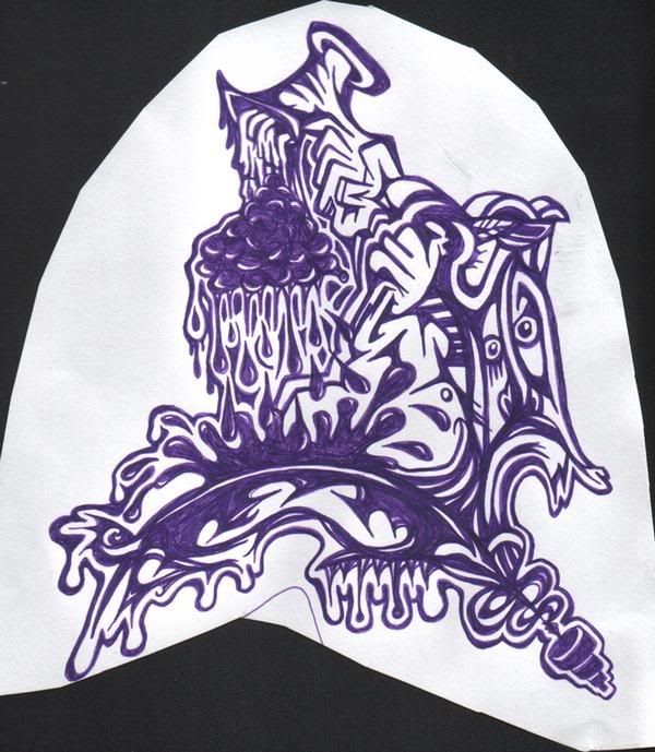
by d-T-r
drew this mother-fucker today/ the other day. no photoshop/illustrator on this computer and other one has fucked up completely beyond repair so cant be doing much retouching with the image for a while. till then: