does it have one ???
has anyone noticed a theme coming through in record covers, flyer designs etc...
...d'n'b were real big on the whole 3d tech thing and breakz was kinda vector based block shapes
would anyone like to see a consistent design element come through or just keep it diverse and all over the show...
PS if people can post gig info can they please include link to a flyer as well, I fully dig flyer designs eh
chur
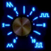
dubstep design aesthetic
dubstep design aesthetic
c/- DEPT of HELL SCIENCE
-
alex bk-bk

- >>>>>>>><<<<<<<<
- Posts: 2216
- Joined: Thu Oct 13, 2005 12:39 pm
- Location: SE london
- Contact:
not a formaly consistent one, now. But it would be nice if the graphics in the scene got better! Short of decent type on Tempa releases and nice FWD flyers, i'm usually fairly repulsed. Sorry if this offends anyone personally.
I'd like to see some graphical exploration of the dubstep sound itself. Every time i'm at FWD, cained off me titties, i'll start thinking about how to graphically represent the pressure in that room and the layers of sound. Eventually i'll figure it out
I'd like to see some graphical exploration of the dubstep sound itself. Every time i'm at FWD, cained off me titties, i'll start thinking about how to graphically represent the pressure in that room and the layers of sound. Eventually i'll figure it out
yeah those skull disco ones are a crack up ...
...they look like they should be painted in fleuro on velvet
like the tempa minimalism and the vex'd cover is pretty phat, looks like a filtered shot from 'pirates of the caribbean"...
...like this too

uhh the grafik on the tshirt !!!
anyone know who the dubpolice models are ???
...they look like they should be painted in fleuro on velvet
like the tempa minimalism and the vex'd cover is pretty phat, looks like a filtered shot from 'pirates of the caribbean"...
...like this too
uhh the grafik on the tshirt !!!
anyone know who the dubpolice models are ???
c/- DEPT of HELL SCIENCE
-
alex bk-bk
- >>>>>>>><<<<<<<<
- Posts: 2216
- Joined: Thu Oct 13, 2005 12:39 pm
- Location: SE london
- Contact:

-
andythetwig

- Posts: 424
- Joined: Fri Oct 28, 2005 3:24 pm
- Location: right up dubmugga's ass
- Contact:
i also like tempa`s design but i dont feel any unique dubstep design at all. we should work it out by ourselves. for me dubstep is deep, dark, flowy, fragmented and tricky. the design have to show what is inside the box. regarding the cultural aspect, its raw and true urban. hmm, i think i`ll also try to do some pixels in the future for dubstep thingies..


-
bp

me too ! Their website is a pure beauty ! Take a look at wallpapers and pics to download !c0p wrote:i also like tempa`s design
http://www.bunzer0.com
http://soundcloud.com/bunzer0
https://www.facebook.com/FOBShow
http://www.mixcloud.com/BunZer0/
BOOKINGS : booking AT bunzer0 DOT com
http://soundcloud.com/bunzer0
https://www.facebook.com/FOBShow
http://www.mixcloud.com/BunZer0/
BOOKINGS : booking AT bunzer0 DOT com
-
andythetwig
- Posts: 424
- Joined: Fri Oct 28, 2005 3:24 pm
- Location: right up dubmugga's ass
- Contact:

Who is online
Users browsing this forum: No registered users and 0 guests